> ## Documentation Index
> Fetch the complete documentation index at: https://patterns.heurilens.com/llms.txt
> Use this file to discover all available pages before exploring further.
# Information Architecture
> A measurable UX pattern where structure, labeling, and navigation determine how users understand, explore, and progress through a product.
## Information architecture is how users think out loud
Information architecture (IA) is not a sitemap.
It is the **mental map** users build while trying to understand:
* what exists here
* how things relate
* where to go next
When that map breaks, users don’t feel “lost” immediately.\
They feel *uncertain* — and start testing paths at random.
## What breaks when information architecture fails
IA failures rarely stop users outright.
Instead, users:
* move back and forth between pages
* open multiple paths “just to check”
* rely on the browser’s back button
* abandon flows without reaching goals
These behaviors signal **navigation doubt**, not exploration.
## Observable behavior linked to IA issues
Information architecture problems often appear as:
* repeated page revisits
* shallow exploration across many sections
* users skipping expected steps
* unexpected exits from structured flows
* hesitation at navigation choices
These are signs of **weak mental modeling**.
 ## Where information architecture matters most
Users are learning what the product offers.
Key signals:
* clarity of categories
* predictability of labels
* sense of coverage
Common failure:
* users explore broadly but commit to nothing
Users try to complete a specific goal.
Key signals:
* step clarity
* visible progress
* logical sequencing
Common failure:
* users jump steps or abandon mid-flow
Users choose between options.
Key signals:
* comparability
* grouping logic
* information hierarchy
Common failure:
* users open multiple pages and leave
## How IA issues become measurable
Users don’t report “bad architecture.”\
They leave behavioral trails.
Heurilens looks for:
* looping navigation paths
* excessive backtracking
* unclear step transitions
* premature exits from structured sections
* exploration without progression
When these signals cluster, an AI breakdown is flagged.
## How Heurilens evaluates information architecture
Heurilens evaluates whether users can predict what they’ll find before clicking.
The system checks whether labels align with user intent and expectation.
Heurilens analyzes whether users move forward through flows without needing to reorient.
The system evaluates whether information supports confident comparison and choice.
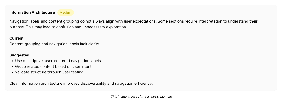
## Example output from Heurilens
Users navigate repeatedly between sections without progressing.
Information grouping and labeling do not support a clear mental model of the product structure.
## How IA fixes differ from visual fixes
IA problems are rarely solved by:
* stronger visuals
* bigger buttons
* more emphasis
They are solved by:
* clearer grouping
* meaningful sequencing
* reduced cross-dependencies
* alignment between user intent and structure
Heurilens highlights **where the structure breaks**,\
not how it should look.
## Why information architecture matters
Information architecture defines:
* how confident users feel navigating
* how quickly they reach outcomes
* how scalable the product becomes
Poor IA increases:
* cognitive effort
* decision fatigue
* abandonment in complex flows
Good IA disappears — because users don’t have to think about it.
## Related patterns
IA defines flow continuity.
Users follow meaning, not structure.
Visual priority supports structural understanding.
Structural confusion increases mental effort.
Run an analysis and see where structure blocks user progress.
## Where information architecture matters most
Users are learning what the product offers.
Key signals:
* clarity of categories
* predictability of labels
* sense of coverage
Common failure:
* users explore broadly but commit to nothing
Users try to complete a specific goal.
Key signals:
* step clarity
* visible progress
* logical sequencing
Common failure:
* users jump steps or abandon mid-flow
Users choose between options.
Key signals:
* comparability
* grouping logic
* information hierarchy
Common failure:
* users open multiple pages and leave
## How IA issues become measurable
Users don’t report “bad architecture.”\
They leave behavioral trails.
Heurilens looks for:
* looping navigation paths
* excessive backtracking
* unclear step transitions
* premature exits from structured sections
* exploration without progression
When these signals cluster, an AI breakdown is flagged.
## How Heurilens evaluates information architecture
Heurilens evaluates whether users can predict what they’ll find before clicking.
The system checks whether labels align with user intent and expectation.
Heurilens analyzes whether users move forward through flows without needing to reorient.
The system evaluates whether information supports confident comparison and choice.
## Example output from Heurilens
Users navigate repeatedly between sections without progressing.
Information grouping and labeling do not support a clear mental model of the product structure.
## How IA fixes differ from visual fixes
IA problems are rarely solved by:
* stronger visuals
* bigger buttons
* more emphasis
They are solved by:
* clearer grouping
* meaningful sequencing
* reduced cross-dependencies
* alignment between user intent and structure
Heurilens highlights **where the structure breaks**,\
not how it should look.
## Why information architecture matters
Information architecture defines:
* how confident users feel navigating
* how quickly they reach outcomes
* how scalable the product becomes
Poor IA increases:
* cognitive effort
* decision fatigue
* abandonment in complex flows
Good IA disappears — because users don’t have to think about it.
## Related patterns
IA defines flow continuity.
Users follow meaning, not structure.
Visual priority supports structural understanding.
Structural confusion increases mental effort.
Run an analysis and see where structure blocks user progress.