> ## Documentation Index
> Fetch the complete documentation index at: https://patterns.heurilens.com/llms.txt
> Use this file to discover all available pages before exploring further.
# Forms CRO
> A measurable UX pattern where friction, uncertainty, or perceived effort inside forms directly reduces conversion.
## Forms are conversion surfaces, not input containers
Forms are where intent turns into commitment.
Users don’t approach forms neutrally.
They arrive with **intent + doubt + limited patience**.
Every field, label, and interaction answers one silent question: “Is this worth completing?”
Forms don’t fail because they are long.
They fail because **effort feels unjustified or unsafe**.
## Where form conversion breaks
Form drop-offs rarely happen at the submit button.
They happen when:
* effort suddenly feels higher than expected
* the reason for a field is unclear
* errors feel punishing
* trust weakens mid-way
* progress feels invisible
Users don’t think “bad UX.” They think “not now” — and leave.
## Observable user behavior inside forms
Form-related friction shows up as:
* focus without typing
* repeated field corrections
* pauses between fields
* scrolling up mid-form
* abandoning after the first error
* abandoning after partial completion
These behaviors indicate **conversion resistance**, not confusion.
 ## Common high-risk form moments
Users decide whether to start.
Signals:
* field count visibility
* perceived effort
* clarity of purpose
Typical failure:
* asking for commitment before value is clear
Users reassess effort vs reward.
Signals:
* unexpected required fields
* unclear labels
* validation interruptions
Typical failure:
* increasing effort without reassurance
Users decide whether to continue.
Signals:
* tone of error messages
* clarity of fix
* loss of entered data
Typical failure:
* emotional punishment for mistakes
## How form friction becomes measurable
Forms create some of the clearest behavioral signals in UX.
Heurilens observes patterns such as:
* abandonment after specific fields
* repeated validation loops
* exits after first error
* hesitation before submission
* reduced completion speed over time
When these signals cluster, **Forms CRO breakdown** is flagged.
## How Heurilens evaluates form conversion
The system evaluates how demanding the form appears before users commit to completing it.
Heurilens checks whether each request feels justified in relation to user intent and context.
Error handling is evaluated for tone, clarity, and ability to recover without loss.
The system assesses whether users feel safe and certain submitting the form.
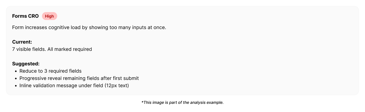
## Example output from Heurilens
Users abandon the form after initial engagement.
Mid-form effort increases without sufficient justification, and error handling reduces confidence to continue.
## Fix directions suggested by Heurilens
Heurilens does not suggest “shorter forms” by default.
Instead, it highlights:
* where perceived effort spikes
* where reassurance is missing
* where errors interrupt momentum
* where commitment is asked too early
The goal is not fewer fields — but **better alignment between effort and intent**.
## Why Forms CRO matters
Forms sit at the narrowest point of conversion funnels.
Small friction here:
* doesn’t create complaints
* doesn’t create obvious UX bugs
* but silently kills outcomes
That makes form UX one of the **highest leverage, least visible** optimization areas.
## Related patterns
Language shapes form confidence.
Emotional safety determines completion.
Credibility reduces hesitation.
Overload increases abandonment.
Run an analysis and identify where your forms lose conversions.
## Common high-risk form moments
Users decide whether to start.
Signals:
* field count visibility
* perceived effort
* clarity of purpose
Typical failure:
* asking for commitment before value is clear
Users reassess effort vs reward.
Signals:
* unexpected required fields
* unclear labels
* validation interruptions
Typical failure:
* increasing effort without reassurance
Users decide whether to continue.
Signals:
* tone of error messages
* clarity of fix
* loss of entered data
Typical failure:
* emotional punishment for mistakes
## How form friction becomes measurable
Forms create some of the clearest behavioral signals in UX.
Heurilens observes patterns such as:
* abandonment after specific fields
* repeated validation loops
* exits after first error
* hesitation before submission
* reduced completion speed over time
When these signals cluster, **Forms CRO breakdown** is flagged.
## How Heurilens evaluates form conversion
The system evaluates how demanding the form appears before users commit to completing it.
Heurilens checks whether each request feels justified in relation to user intent and context.
Error handling is evaluated for tone, clarity, and ability to recover without loss.
The system assesses whether users feel safe and certain submitting the form.
## Example output from Heurilens
Users abandon the form after initial engagement.
Mid-form effort increases without sufficient justification, and error handling reduces confidence to continue.
## Fix directions suggested by Heurilens
Heurilens does not suggest “shorter forms” by default.
Instead, it highlights:
* where perceived effort spikes
* where reassurance is missing
* where errors interrupt momentum
* where commitment is asked too early
The goal is not fewer fields — but **better alignment between effort and intent**.
## Why Forms CRO matters
Forms sit at the narrowest point of conversion funnels.
Small friction here:
* doesn’t create complaints
* doesn’t create obvious UX bugs
* but silently kills outcomes
That makes form UX one of the **highest leverage, least visible** optimization areas.
## Related patterns
Language shapes form confidence.
Emotional safety determines completion.
Credibility reduces hesitation.
Overload increases abandonment.
Run an analysis and identify where your forms lose conversions.