Cognitive Load as a UX failure pattern
A Cognitive Load Spike happens when users must process too many decisions, signals, or chunks of information at the same time. This is not about “complex products.”It is about momentary overload — the user’s brain cannot confidently decide what to do next.
Cognitive load is measurable because overload produces predictable user behavior: hesitation, backtracking, repeated scanning, and delayed action.
What typically triggers cognitive load
Common triggers include:- too many options presented without grouping
- dense UI blocks (cards, tables, text) competing for attention
- unclear labels that require interpretation
- multiple CTAs with similar weight
- mixed intent within the same section (learn + compare + buy at once)
Observable user behavior signals
You’ll often see:- users pausing without interacting
- repeated back-and-forth scanning
- abandoned tasks mid-flow
- clicks on “secondary” items while trying to understand “primary” ones
- delayed completion even when the flow is short
When users think too much, they move less.
Product-level signals Heurilens looks for
Heurilens flags cognitive load when sections contain:- multiple competing decision points in one viewport
- weak grouping (spacing does not form “chunks”)
- similar-looking elements with different meanings
- instructions that appear after the user needs them
- mixed hierarchy (headings and body text visually similar)
How Heurilens detects this pattern
Decision density
Counts and classifies decision points (CTAs, links, toggles, selectable items) within a section.
Chunking quality
Evaluates spacing, grouping, and hierarchy to determine whether content forms scannable units.
Instruction timing
Checks whether guidance appears before the decision moment or after confusion begins.
Meaning ambiguity
Detects labels and UI patterns that require interpretation rather than recognition.
Real-world examples (what this looks like on websites)
Example 1 — Pricing pages with too many choices
Example 1 — Pricing pages with too many choices
Typical signals:
- 3+ plans, each with long feature lists
- multiple “Best value” labels
- add-ons mixed into the same table
- compare without deciding
- scroll repeatedly between plans and FAQ
- postpone purchase “to decide later”
Example 2 — Feature pages that mix intent
Example 2 — Feature pages that mix intent
Typical signals:
- hero tries to explain, sell, and educate at once
- multiple CTAs (Book demo, Try free, Watch video) with similar weight
- too many product screenshots stacked
- scroll quickly without reading
- miss the primary action
- click random items to “figure it out”
Example 3 — Forms that ask too much too early
Example 3 — Forms that ask too much too early
Typical signals:
- long form with unclear field purpose
- too many required fields
- helper text hidden or missing
- abandon halfway
- input errors increase
- submit hesitation grows
Example output from Heurilens
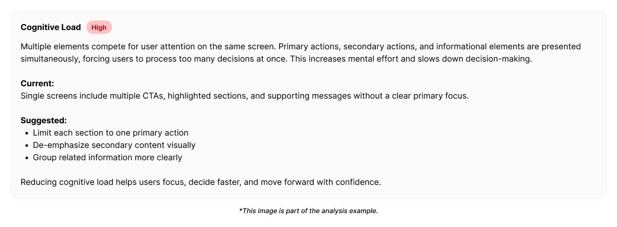
Cognitive Load Spike Detected
This section contains multiple competing decision points without clear grouping.Users are required to compare, interpret, and choose within a single viewport,
increasing hesitation and delaying task progression.
Example fix direction generated by Heurilens
Instead of prescribing a single “UI rule,” Heurilens suggests load-reducing patterns:- reduce decisions per viewport (progressive disclosure)
- group related choices into clear chunks
- elevate the primary action and demote alternatives
- move explanations before the decision moment
- convert comparisons into guided selection (recommended defaults)
Why this pattern matters
Cognitive load spikes do not always reduce traffic.They reduce conversion efficiency. Users still move through the page — but slower, less confidently, and with more drop-off at decision points.
Related patterns
Visual Hierarchy
When attention priorities are unclear, cognitive load increases.
Readability
Dense content and weak structure amplify mental effort.
First Impression Breakdown
Early confusion often begins as cognitive overload in the initial viewport.
Forms CRO
Forms are high-risk surfaces where cognitive load becomes abandonment.
See cognitive load spikes on your product
Run an analysis and see where your interface demands too much thinking at once.