What is a Visual Hierarchy Failure?
A Visual Hierarchy Failure occurs when interface elements compete for attention without a clear priority. Users cannot easily determine:- what matters most
- where to look first
- which action is primary
It is an attention-order failure that directly affects decision speed and confidence.
Why visual hierarchy is measurable
When hierarchy fails, users leave consistent behavioral traces. These traces appear before conversion, clicks, or form submissions.Attention fragmentation
Attention fragmentation
Users shift focus between multiple elements without committing to one.
Secondary-first interaction
Secondary-first interaction
Users interact with visually prominent but non-primary elements.
Delayed primary action
Delayed primary action
The main CTA is seen late or after unnecessary exploration.
User behavior signals
A Visual Hierarchy Failure is associated with:- repeated scanning patterns
- hesitation before interaction
- misaligned clicks
- delayed task initiation
Product-level signals
At the interface level, this pattern often appears alongside:- multiple elements with equal visual weight
- headings that do not dominate supporting content
- CTAs lacking contrast or separation
- inconsistent spacing and grouping
- color and size used without priority logic
How Heurilens detects this pattern
Element dominance analysis
Element dominance analysis
Heurilens evaluates size, weight, color contrast, and positioning
to determine which elements visually dominate the viewport.
Hierarchy consistency check
Hierarchy consistency check
The system checks whether hierarchy signals remain consistent
across sections and states.
Action visibility evaluation
Action visibility evaluation
Primary actions are assessed for visual separation and clarity
relative to secondary actions.
Example output from Heurilens
Visual Hierarchy Failure Detected
Multiple elements compete for attention within the initial viewport.The primary action does not visually dominate supporting content,
causing attention to fragment and delaying the first meaningful interaction.
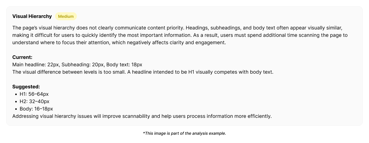
Example fix generated by Heurilens
Why this pattern matters
Visual hierarchy failures rarely block users outright. Instead, they slow decisions, reduce confidence, and lower conversion efficiency. Users eventually act — but later, less decisively, or incorrectly. This makes hierarchy issues subtle but high-impact.Patterns commonly associated with this breakdown
First Impression Breakdown
When users fail to understand value and next steps immediately.
Cognitive Load Spike
When too much information competes for attention at once.
CTA Ambiguity
When primary and secondary actions are visually indistinguishable.
Consistency Breakdown
When hierarchy rules change across sections or pages.
Visual hierarchy is not subjective design taste. It is reflected in where users look, hesitate, and act. Heurilens measures these signals to turn attention problems into structured, actionable insights.
See visual hierarchy issues on your product
Run an analysis and see how hierarchy failures appear across real interfaces.