Behavioral UX is not persuasion
Behavioral UX is often misunderstood as “convincing users.” It is not. Behavioral UX is about removing friction between intent and actionby aligning interface cues with how people naturally behave. Users don’t decide first.
They react first — then justify.
What breaks when behavioral UX fails
When behavioral cues are misaligned, users:- hesitate even when value is clear
- postpone decisions they intended to make
- choose safer but less relevant options
- abandon actions without clear reasons
But behavior changes.
When users behave differently than expected, the interface is speaking louder than the copy.
Common behavioral mismatches
1. Effort feels higher than reward
- CTA exists but feels “heavy”
- commitment is unclear
- risk feels front-loaded
Users delay or avoid action.
2. Choice architecture is misaligned
- too many similar options
- no recommended path
- defaults don’t reflect common intent
Users compare instead of choosing.
3. Feedback timing is off
- system responds late or unclearly
- success feels muted
- errors feel punitive
Users lose momentum.
Behavioral signals Heurilens looks for
Heurilens does not guess intent.It observes reaction patterns. Signals include:
- hesitation before high-intent actions
- repeated safe interactions (scrolling, hovering)
- avoidance of irreversible steps
- reliance on defaults or exits
- drop-offs at predictable decision moments
How behavioral patterns emerge on websites
Behavioral UX issues rarely exist alone.Typical surfaces:
They appear at moments of choice, risk, or commitment.
- pricing comparisons
- signup and onboarding steps
- irreversible actions (delete, pay, submit)
- optional upsells or add-ons
- “last step” confirmations
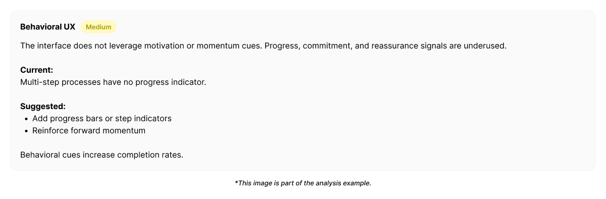
Example output from Heurilens
Behavioral Friction Detected
Users demonstrate hesitation at commitment points despite clear value signals.Interface cues increase perceived effort and risk,
causing avoidance of the primary action.
Behavioral fix directions (not UI rules)
Heurilens does not prescribe manipulation tactics.It suggests alignment adjustments:
- reduce perceived commitment before actual commitment
- guide choice instead of presenting equal options
- use defaults to reflect common intent
- make progress visible and reversible
- reinforce success immediately after action
Why this pattern matters
Behavioral UX failures don’t kill conversion.They delay it. Users intend to act —
but friction in cues makes “later” feel safer than “now.” Over time, this compounds into lost momentum, not lost traffic.
Related patterns
Cognitive Load
Overload increases behavioral resistance.
Trust Signals
Trust reduces perceived risk.
UX Writing
Language shapes expectation and confidence.
Visual Hierarchy
Visual cues influence attention and action order.
See behavioral friction on your product
Run an analysis and see how interface cues shape user behavior.