Readability as a UX signal
Readability problems are rarely noticed consciously.Users do not think “this text is hard to read” —
they simply stop processing information. This makes readability one of the most silent, yet most damaging UX failure patterns.
Readability is not about writing quality.
It is about how efficiently information is absorbed.
It is about how efficiently information is absorbed.
What breaks when readability fails
When readability breaks, content is still visible —but meaning is delayed or lost. Common failure modes:
- information is buried in long paragraphs
- headings do not guide scanning
- text blocks feel visually heavy
- emphasis is unclear or overused
Observable user behavior
“Users don’t scroll because they’re curious.Behavioral traces linked to readability failure:
They scroll because they’re searching for clarity.”
- repeated up/down scrolling
- partial reading (skipping sections)
- long dwell time without interaction
- delayed decisions after content exposure
Product-level signals
At the interface level, readability breakdowns often appear as:- paragraphs exceeding comfortable line length
- inconsistent spacing between text blocks
- headings visually similar to body text
- low contrast between text and background
- dense content above the fold
How Heurilens detects readability issues
Instead of judging text quality, Heurilens evaluates processing effort.Text density & line length
Text density & line length
Measures paragraph length and character count per line
to identify scanning fatigue risks.
Scannability structure
Scannability structure
Checks whether headings, spacing, and emphasis
create a clear reading path.
Example output from Heurilens
Readability Breakdown Detected
Users require increased cognitive effort to extract key information.Dense paragraphs and weak visual separation reduce
scanning efficiency and delay comprehension.
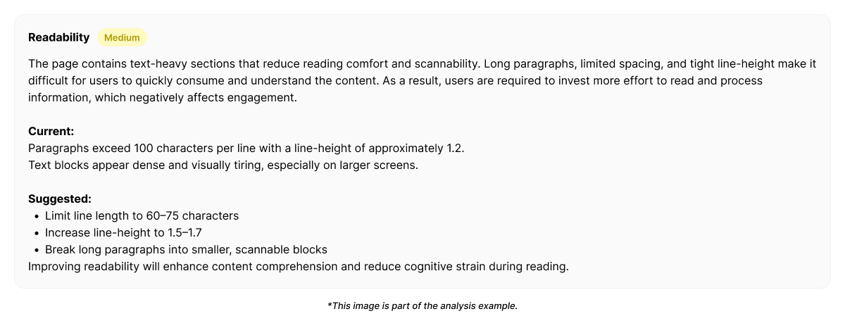
Example fix generated by Heurilens
Why this pattern matters
Readability failures do not cause immediate exits. They cause slow disengagement. Users stay longer, but: understand less miss key points hesitate to act This makes readability issues hard to detect without measurement.Related patterns
Visual Hierarchy
When text lacks clear emphasis and priority.
Cognitive Load
When information density exceeds processing capacity.
Detect readability issues on your product
Analyze a page and see where content becomes difficult to process.