Consistency as a UX failure pattern
A Consistency Breakdown occurs when the same elements, actions, or meanings behave or appear differently across the product. Users rely on learned rules.When those rules change unexpectedly, users slow down, hesitate, or make mistakes. Consistency is not visual sameness.
It is predictability of meaning and behavior.
Consistency is measurable because broken expectations produce hesitation, errors, and backtracking — not complaints.
What typically breaks consistency
Common causes include:- buttons that look the same but act differently
- the same action labeled differently across pages
- inconsistent spacing, alignment, or grouping rules
- components that change style or behavior between states
- navigation patterns that shift across sections
- form fields that validate differently in similar contexts
Observable user behavior signals
When consistency breaks, users often:- pause before interacting with familiar elements
- re-check labels or hover for confirmation
- make incorrect selections
- backtrack to “verify” what they just learned
- lose speed in otherwise simple flows
When users stop trusting patterns, every step becomes a decision.
Product-level signals Heurilens looks for
Heurilens flags consistency issues when it detects:- identical components with different visual treatments
- repeated actions placed in different locations
- inconsistent feedback patterns (success, error, loading)
- similar pages using different hierarchy rules
- mismatched interaction states (hover, focus, disabled)
How Heurilens detects this pattern
Component parity check
Compares shared components across pages to detect visual or behavioral drift.
Label & meaning alignment
Checks whether the same action uses consistent wording and intent.
Interaction state analysis
Evaluates hover, focus, loading, and error states for consistency.
Layout rule comparison
Detects spacing, alignment, and grouping inconsistencies across sections.
Real-world examples (what this looks like on websites)
Example 1 — CTA inconsistency across pages
Example 1 — CTA inconsistency across pages
Typical signals:
- “Get started” on one page, “Try free” on another, “Sign up” elsewhere
- primary CTA placement changes between pages
- hesitate before clicking
- re-read button labels
- delay commitment
Example 2 — Form behavior inconsistency
Example 2 — Form behavior inconsistency
Typical signals:
- required fields differ without explanation
- validation appears sometimes inline, sometimes after submit
- make repeat errors
- re-enter information
- abandon forms out of frustration
Example 3 — Navigation rule changes
Example 3 — Navigation rule changes
Example output from Heurilens
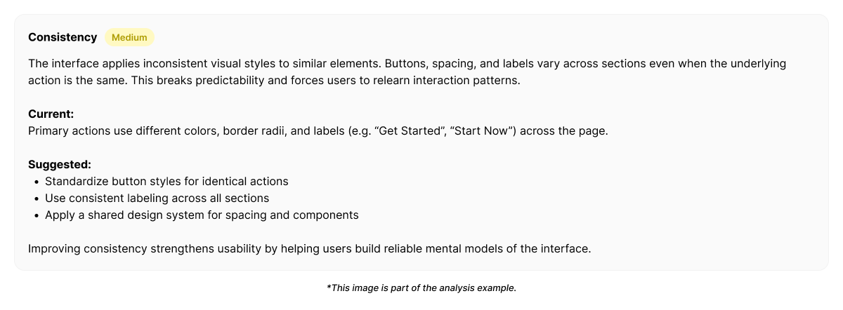
Consistency Breakdown Detected
Shared components and actions behave inconsistently across pages.Users are required to re-learn interaction rules,
increasing hesitation and reducing flow efficiency.
Example fix direction generated by Heurilens
Rather than enforcing sameness, Heurilens recommends rule alignment:- define a single meaning per action (one label, one intent)
- standardize component behavior across states
- apply spacing and hierarchy rules consistently
- centralize feedback patterns (success, error, loading)
- treat navigation as a system, not page-by-page decisions
Why this pattern matters
Consistency breakdowns rarely block users immediately.They erode confidence and momentum. Over time, users:
- trust the product less
- move more cautiously
- convert less efficiently
Related patterns
Visual Hierarchy
Inconsistent hierarchy rules confuse attention priorities.
Cognitive Load
Re-learning rules increases mental effort.
Readability
Inconsistent text structure slows comprehension.
Forms CRO
Forms amplify the cost of inconsistent rules.
See consistency issues on your product
Run an analysis and see where interface rules change unexpectedly.