Emotional design is not decoration
Emotional design is often mistaken for visual delight. It is not about illustrations, gradients, or animations alone.It is about how an interface makes users feel at critical moments —
and how that feeling affects their willingness to continue. Users don’t only ask: “Can I do this?” They also ask, silently: “Does this feel safe?” “Does this feel right?” “Am I confident continuing?”
What breaks when emotional design fails
When emotional cues are misaligned, users may:- technically understand the interface
- know what to do next
- still hesitate or disengage
- cold or indifferent at high-effort moments
- overly aggressive at low-commitment moments
- playful when seriousness is expected
- silent when reassurance is needed
Emotion fills the gap between clarity and confidence.
Emotional signals users react to
Users subconsciously react to cues such as:- tone of microcopy
- presence or absence of reassurance
- visual calm vs visual tension
- perceived effort vs perceived reward
- how mistakes are acknowledged
Where emotional design matters most
- High commitment moments
- Learning & exploration
- Errors & recovery
Examples:
- pricing decisions
- checkout or payment steps
- irreversible actions
- reassurance
- seriousness
- clarity without pressure
- cheerful or vague tone where certainty is expected
Observable behavior linked to emotional friction
Emotional design issues often show up as:- hesitation despite clear instructions
- abandonment after small setbacks
- avoidance of irreversible actions
- reduced exploration of optional features
- users “giving up” earlier than expected
How Heurilens interprets emotional signals
Heurilens does not try to guess emotions.It correlates interface moments with behavioral shifts. Signals include:
- drop-offs after errors
- pauses before high-risk actions
- reduced interaction after negative feedback
- increased exits after emotionally cold surfaces
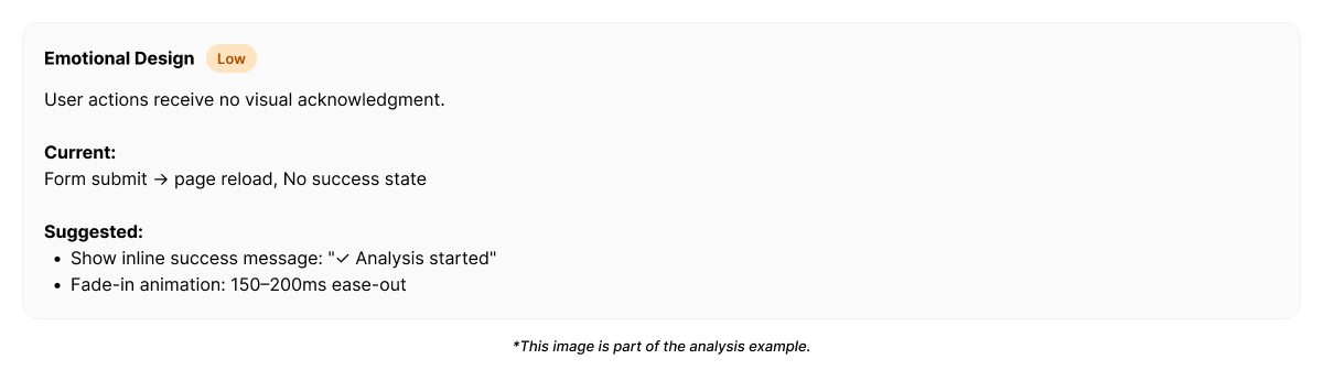
Example output from Heurilens
Emotional Friction Detected
Users disengage at high-effort moments despite functional clarity.The interface lacks reassurance and emotional grounding,
reducing confidence to proceed.
Emotional fix directions (not visual rules)
Instead of “adding delight,” Heurilens suggests emotional alignment:- match tone to commitment level
- acknowledge effort before asking for more
- reduce blame in error states
- reinforce progress and safety
- remove unnecessary pressure language
Why this pattern matters
Emotional design failures do not break usability.They break momentum. Users may understand the interface perfectly
and still decide not to continue. This makes emotional design subtle, powerful, and easy to overlook without behavioral measurement.
Related patterns
Behavioral UX
Emotional cues directly influence behavior.
Trust Signals
Emotional reassurance strengthens credibility.
UX Writing
Language sets emotional tone.
Cognitive Load
Overload amplifies emotional stress.
See emotional friction on your product
Run an analysis and see where emotional cues influence user behavior.