Mobile UX is about context, not screen size
Mobile UX is not desktop UX made smaller. Mobile users interact while:- standing
- walking
- waiting
- multitasking
- switching attention frequently
What breaks when mobile UX fails
Mobile failures rarely feel dramatic. Users often:- abandon tasks mid-way
- postpone actions “for later”
- scroll without committing
- mis-tap and lose confidence
- stop interacting after small friction
Observable behavior specific to mobile UX
Mobile-related friction appears as:- frequent task interruption
- incomplete actions without retries
- shallow scrolling without engagement
- accidental interactions followed by exits
- reduced completion rates compared to desktop
Mobile moments where UX matters most
Single-hand interaction
Single-hand interaction
Users often operate with one thumb.Risk:
- important actions require reach or precision
- effort feels higher than expected
- hesitation or abandonment
Interrupted sessions
Interrupted sessions
Mobile sessions are fragile.Risk:
- progress is lost when users switch apps
- no visible return state
- users do not resume tasks
Compressed decision time
Compressed decision time
Users decide quickly.Risk:
- unclear value or next step
- too many choices at once
- immediate exits
Mobile UX is measurable
Users do not say: “This is bad mobile UX.” Instead, Heurilens observes:- high drop-off rates on mobile-specific flows
- actions started but not completed
- reduced engagement compared to desktop
- repeated short sessions without progress
- exits after mis-taps or unclear states
How Heurilens evaluates mobile experience
Context sensitivity
Heurilens evaluates whether flows tolerate
interruption and short attention spans.
Action reach and clarity
The system checks whether primary actions
are easy to discover and activate on mobile.
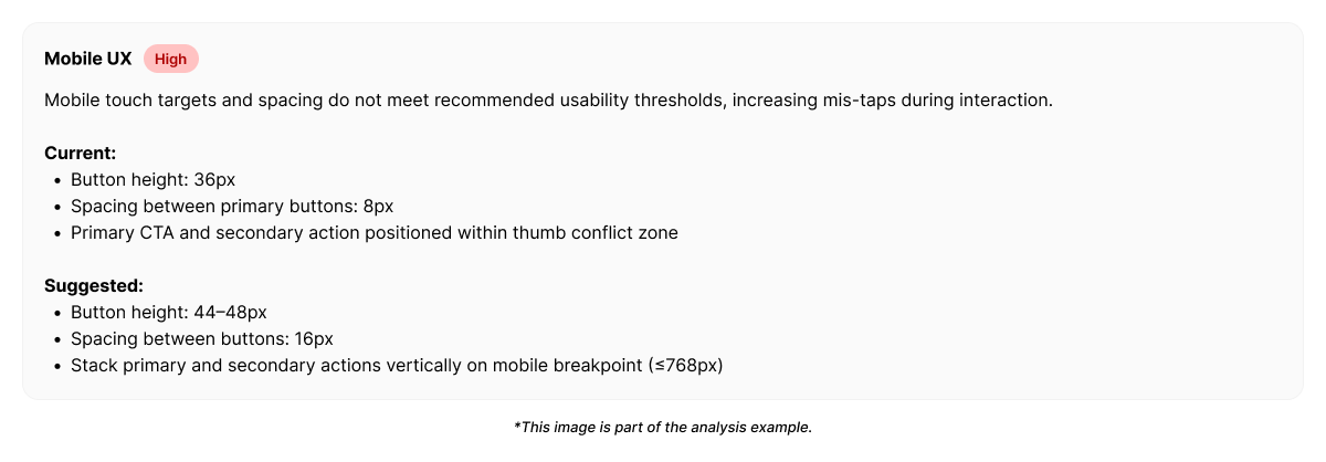
Example output from Heurilens
Mobile UX Friction Detected
Mobile users initiate actions but fail to complete them.The interface does not support interruption,
single-hand interaction, or quick decision-making.
Mobile UX is not about feature parity
Good mobile UX does not mean:- every desktop feature must exist
- every flow must be identical
- respecting limited attention
- supporting partial progress
- reducing precision requirements
- enabling fast, confident actions
Related patterns
User Flow
Mobile flow breaks faster under friction.
Interaction Design
Feedback clarity matters more on mobile.
Cognitive Load
Limited attention amplifies overload.
Forms CRO
Forms are more fragile on mobile.
See mobile UX issues on your product
Run an analysis and identify where mobile context breaks user momentum.